Queensland Music Trails rebrand
Brisbane Branding Project 2024


The Brand Story
In the dynamic realms of travel, tourism, and music, creating a cohesive and captivating brand identity is paramount to capturing the audience's imagination and enhancing their overall experience. This case study explores the innovative branding strategy and identity developed for the Queensland Music Festival (QMF) and Queensland Music Trails (QMT), focusing on unifying their visual and experiential identities.
The primary objective was to craft a concept that seamlessly aligned the QMF and QMT under a singular, recognisable brand while emphasising their unique themes of travel, tourism, and music. This necessitated a creative approach that not only visually represented the events but also engaged attendees in an interactive and memorable manner.
To achieve this, the decision was made to design the logos in the style of airport stamps, a universally recognised symbol of travel and exploration. This design choice effectively conveyed the adventurous spirit of the QMT while maintaining a strong visual link to the QMF.
The airport stamp concept was brought to life through a series of activations at the events. Attendees were given QMT passports, which they could use to collect stamps at various checkpoints throughout the festival and trails. This interactive element not only reinforced the travel theme but also encouraged engagement and movement across the event spaces, enhancing the overall attendee experience.
The integration of the passport stamps into the event branding proved to be a successful strategy, fostering a sense of journey and discovery among participants. It created a unique, immersive experience that resonated with the audience, blending the themes of travel and music in a tangible and enjoyable way.
This case study delves into the strategic planning, creative process, and execution of this innovative branding initiative, highlighting its success in aligning the QMF and QMT under a cohesive, engaging, and memorable brand identity.

Colour Palette
We moved away from the loud and disparate colour schemes of the past, embracing a more refined and cohesive approach to better align with QMF's maturity and inclusivity. For QMT, we curated a friendly and approachable colour palette, ensuring a consistent yet versatile visual identity.
For the Outback Trail, we drew inspiration from the rich, red earth of the outback, creating a palette that evokes the rugged beauty of the landscape. The Southern Trail's colours pay homage to opera, incorporating a sophisticated range of purples that reflect its artistic roots.
Diving into the ocean's depths, the Reef Trail's palette features shades of blue and sand, capturing the serene and vibrant essence of the underwater world. For Brisbane, we chose bright and bold blues with touches of maroon to represent the city's dynamic and energetic spirit.
The Tropics Trail encapsulates the lush and diverse environment in just four colours, from sandy cream to vibrant tropic green and deep bark brown, bringing the tropical landscape to life. Finally, the Scenic Rim Trail shines with a bright and cheery yellow sunset palette, reflecting the warm and welcoming nature of the region.
Through these thoughtfully tailored colour schemes, we ensured that each trail not only stands out on its own but also contributes to a unified and engaging brand experience for the Queensland Music Festival.
Typography styling
We streamlined the typography across all brands to enhance consistency and legibility. By reducing the number of fonts significantly—from eight in QMF and four in QMT to just one heading and one paragraph font for each—we ensured coherence across all touchpoints. For the trail brands, we introduced a new typeface, Alegra Sans, to provide a modern and cohesive look that aligns with the unique identities of each trail.
By simplifying the font usage and introducing Alegra Sans, we achieved a visually harmonious brand experience, enhancing both the festival's overall appeal and the unique charm of each trail. This strategic refinement of typography ensures that the Queensland Music Festival and its sub-brands are instantly recognisable and consistently engaging, whether in print or digital formats.
Logo system

I designed a flexible logo system that seamlessly accommodated the diverse brand elements of QMF and QMT. To ensure a consistent visual anchor across all communications, both the QMF and QMT logos were prominently featured in the brand lockup. For the Trails, we reserved their logos for hero posters, maintaining a clear hierarchy while showcasing the diversity of events. Additionally, for each trail, we created a unique stamp logo to highlight the tourism aspect of the product, adding a touch of local charm and authenticity. This approach provided a cohesive yet adaptable branding strategy that enhanced the overall identity and appeal of the Queensland Music Festival and its associated trails.
Evolutionary event branding
We allowed for individual event branding to evolve yearly based on the target audience and event vibe, providing the flexibility needed to keep each event fresh and relevant. To ensure consistency, we provided comprehensive guidelines that aligned each event's branding with the overarching identities of QMF and QMT. This approach allowed for creative expression and adaptation while maintaining a cohesive and recognisable festival brand.

Custom Illustrations
We created custom illustrations and backgrounds for each trail, bringing the brand to life and capturing the essence of each unique location. For each trail, we designed over 20 illustrations to support the wide range of marketing assets that needed to be developed. By ensuring consistency in style and execution, we reinforced the brand identity across all collateral, providing a cohesive and visually appealing experience.
Individual Trails
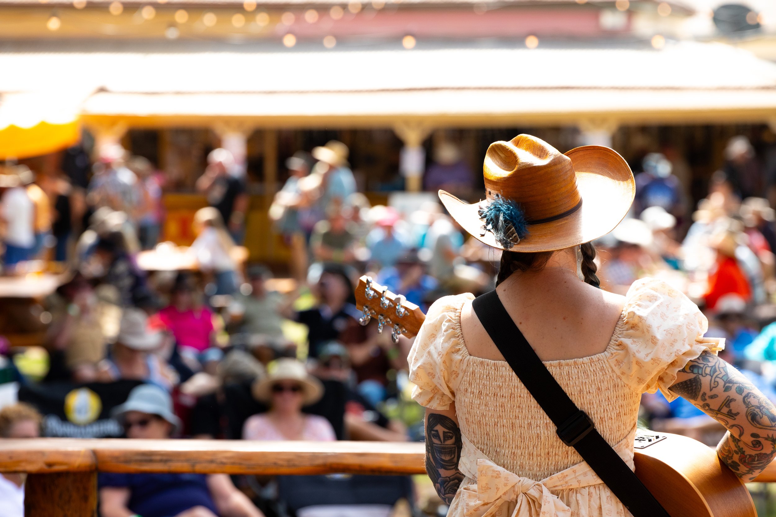
Embark on a musical adventure through Queensland's diverse landscapes and rich cultural tapestry with Queensland Music Festival (QMF) and its six captivating trail brands. From the rugged beauty of the Outback Trail to the dynamic energy of Brisbane's Music Trail, each trail offers a unique journey filled with music, culture, and unforgettable experiences.
Outback trail
Nestled amidst the vast expanses of Outback Queensland, the Outback Trail spans through the charming towns of Roma, Quilpie, and Tambo. Inspired by the breathtaking hues of the outback landscape, our colour palette evokes the warm embrace of reds and oranges, infusing every aspect of the brand with the vibrant essence of the region. At the heart of our identity lies our logo—a distinctive buckle-shaped stamp, a symbol of the rugged and adventurous spirit that defines the Outback. With each element thoughtfully crafted, the Outback Trail brand invites adventurers to embark on a journey through untamed beauty and boundless possibility.

Southern Trail
Amoung in the picturesque locale of Jimbour, Queensland, our trail exudes a sense of timeless elegance and cultural significance. Inspired by the rich history of opera events held at Jimbour, our colour palette pays homage to this tradition with shades of purples, reminiscent of the iconic themes that have adorned the performances for over a decade. At the heart of our brand lies our logo—a circular stamp that seamlessly weaves together elements of heritage and agriculture. Featuring cotton motifs, it honors the region's profound connection to cotton farming while embracing a design that reflects the timeless charm of Jimbour's heritage. With every detail meticulously crafted, our trail brand invites visitors to immerse themselves in a journey that seamlessly intertwines culture, history, and natural beauty.

The Reef Trail
Through the sun-kissed shores of Mackay, Queensland, our trail captures the essence of coastal bliss and tropical wonder. Inspired by the mesmerizing marine landscape of the Great Barrier Reef, our colour palette dances with dark greens, ocean blues, and sandy tones, invoking the tranquil beauty of the underwater world. At the heart of our brand lies our logo—a whimsical wavy stamp adorned with a graceful turtle, a symbol of the abundant marine life and natural splendor that grace the reef's waters. With each element thoughtfully crafted, our trail invites adventurers to dive into a world of coastal enchantment and discover the magic of Mackay.

Brisbane Music Trail
Amidst the bustling streets of Brisbane, Queensland, our trail invites explorers to discover the vibrant heartbeat of the city. Inspired by Brisbane's iconic color, our color palette dances with maroon hues, complemented by electric blue and baby blue tones, creating a captivating presence in a saturated market. At the heart of our brand lies our logo—a playful circular design with divots, featuring the iconic Story Bridge as a central motif. This whimsical emblem captures the essence of Brisbane's urban landscape, inviting visitors to embark on a journey through the city's dynamic energy and cultural diversity.

Tropics Trail
Nestled amidst the lush tropical beauty of Cairns and Yarrabah, Queensland, our trail beckons with the promise of exotic adventures and natural wonders. Inspired by the verdant hues of the region's landscape, our color palette radiates with vibrant greens, evoking the enchanting allure of the tropical paradise. At the heart of our brand lies our logo—a whimsical triangular stamp adorned with a graceful palm tree, a symbol of the region's abundant natural beauty and serene tranquility. With each element thoughtfully crafted, our trail invites adventurers to immerse themselves in the breathtaking landscapes and vibrant cultures of Cairns and Yarrabah.
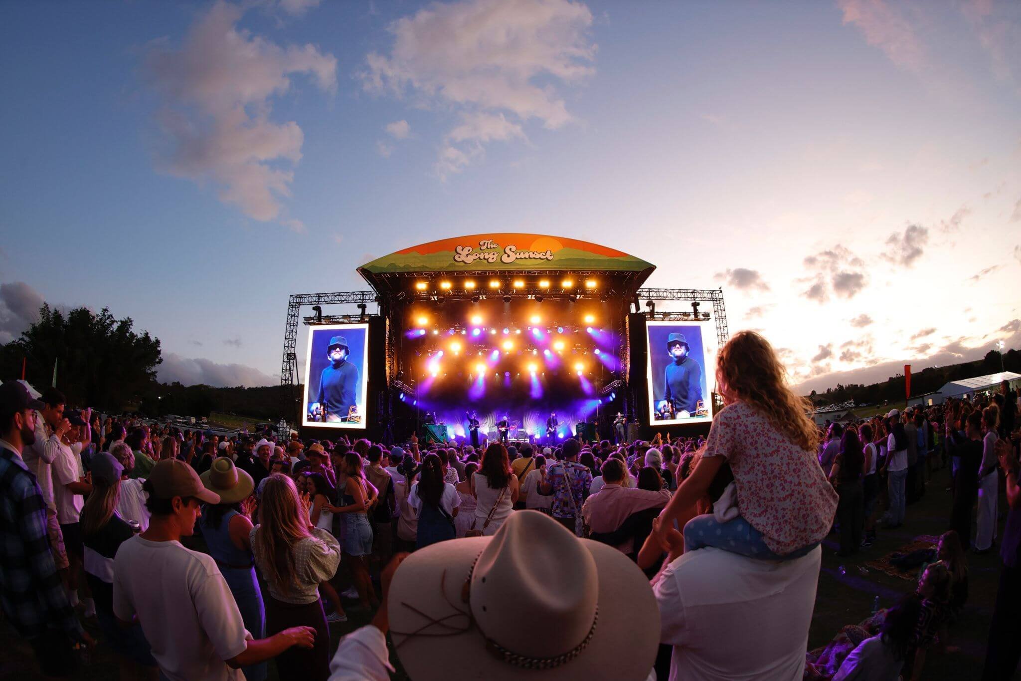
Scenic Rim Trail
Nestled amidst the breathtaking vistas of the Scenic Rim, Queensland, our trail invites adventurers to explore the tranquil beauty of this idyllic region. Inspired by the verdant landscapes and the mesmerizing spectacle of The Long Sunset, our color palette bursts with vibrant greens and golden yellows, echoing the hues of nature's canvas. At the heart of our brand lies our logo—a charming half-circle stamp adorned with a radiant sun motif, capturing the enchanting beauty of the sunset over the scenic landscape. With each element thoughtfully crafted, our trail beckons travelers to embrace the serenity and splendor of the Scenic Rim, where every moment is a brushstroke of natural wonder.
Conclusion
We achieved a unified and coherent brand identity across QMF, QMT, and individual trails, significantly reducing confusion and elevating brand recognition. By aligning visual elements with the essence of each brand component, we improved brand perception, ensuring consistency and resonance across all touchpoints. This approach also enhanced flexibility for event branding, allowing for seamless adaptation to changing audiences and event dynamics. Moreover, our custom illustrations and backgrounds enriched engagement and fostered a deeper connection with audiences, amplifying the allure and impact of the brand and its events.
The rebranding of Queensland Music Festival, Queensland Music Trails and the individual Trails branding demonstrates the power of strategic brand design in unifying diverse brand components under a cohesive identity. By harmonising colours, streamlining typography, implementing a dynamic logo system, and creating custom illustrations, the brand now communicates a consistent message while allowing for flexibility and evolution. This approach has not only resolved the previous issues of inconsistency but also positioned QMF as a dynamic and inclusive cultural event that resonates with diverse audiences across Queensland.