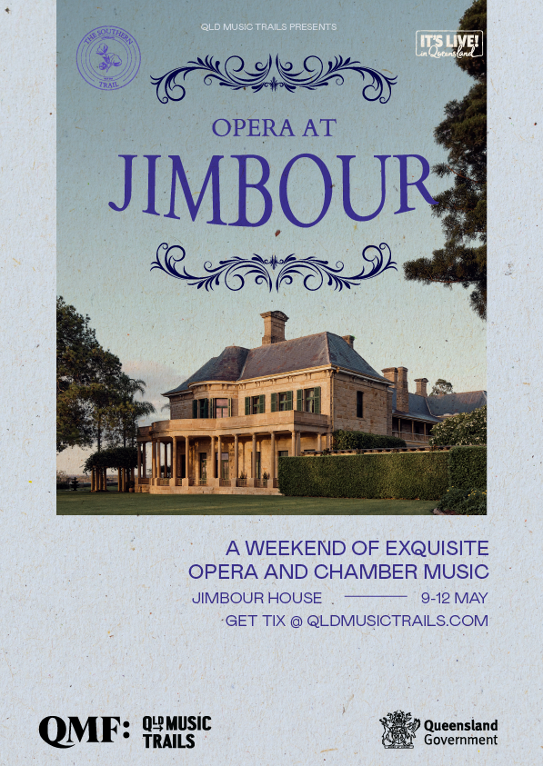
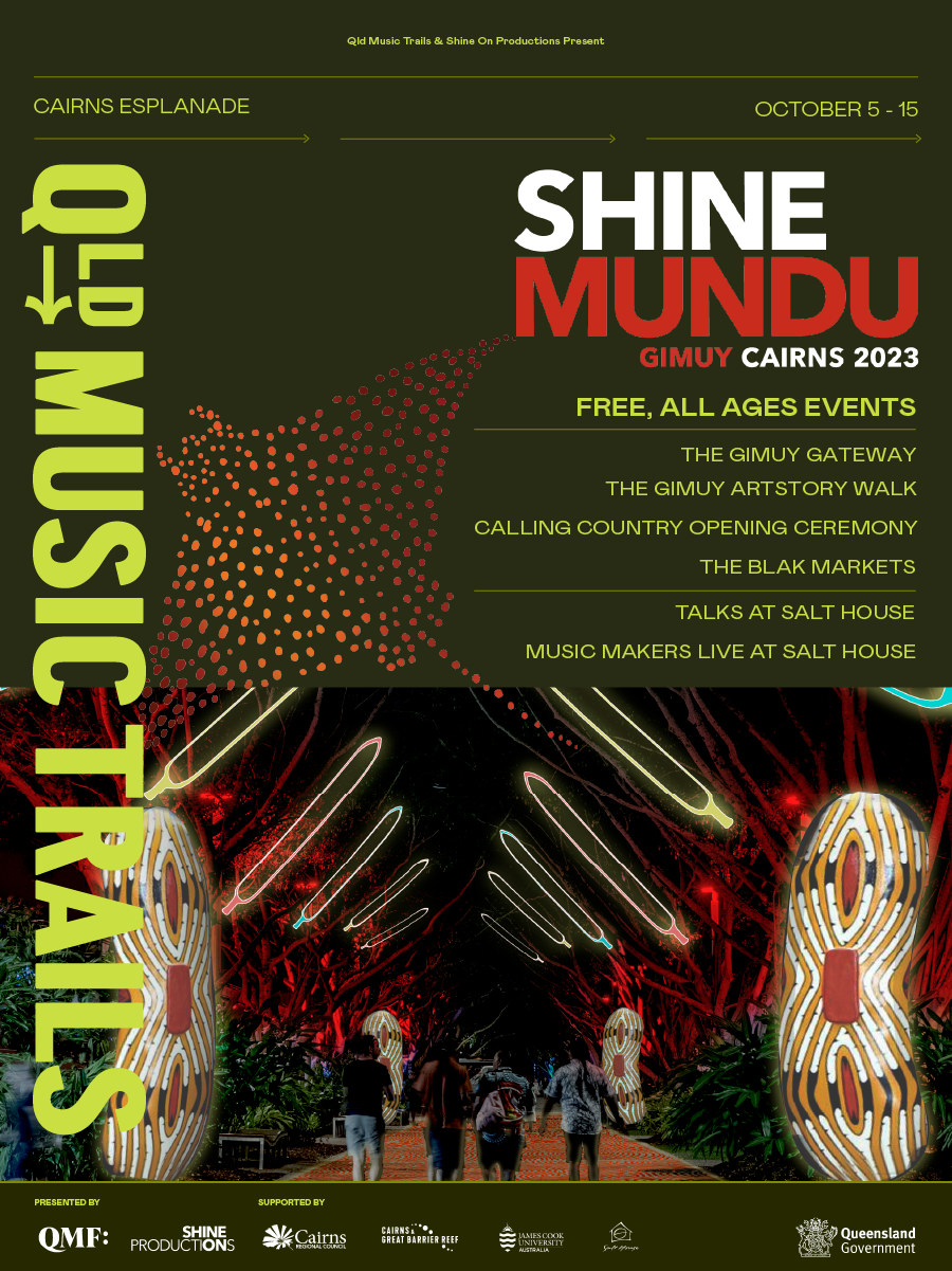
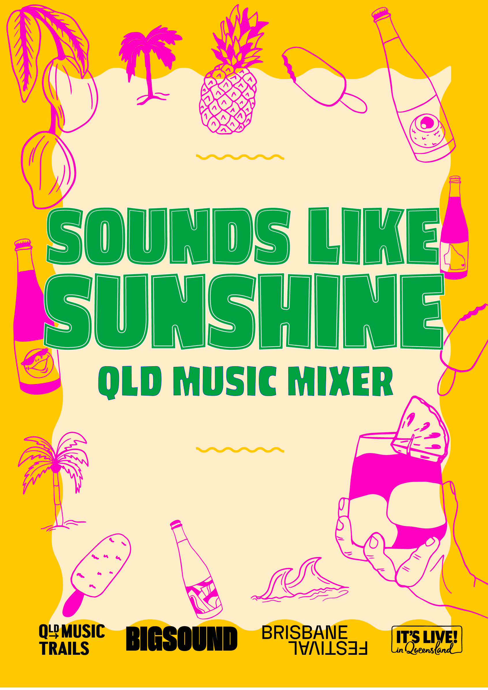
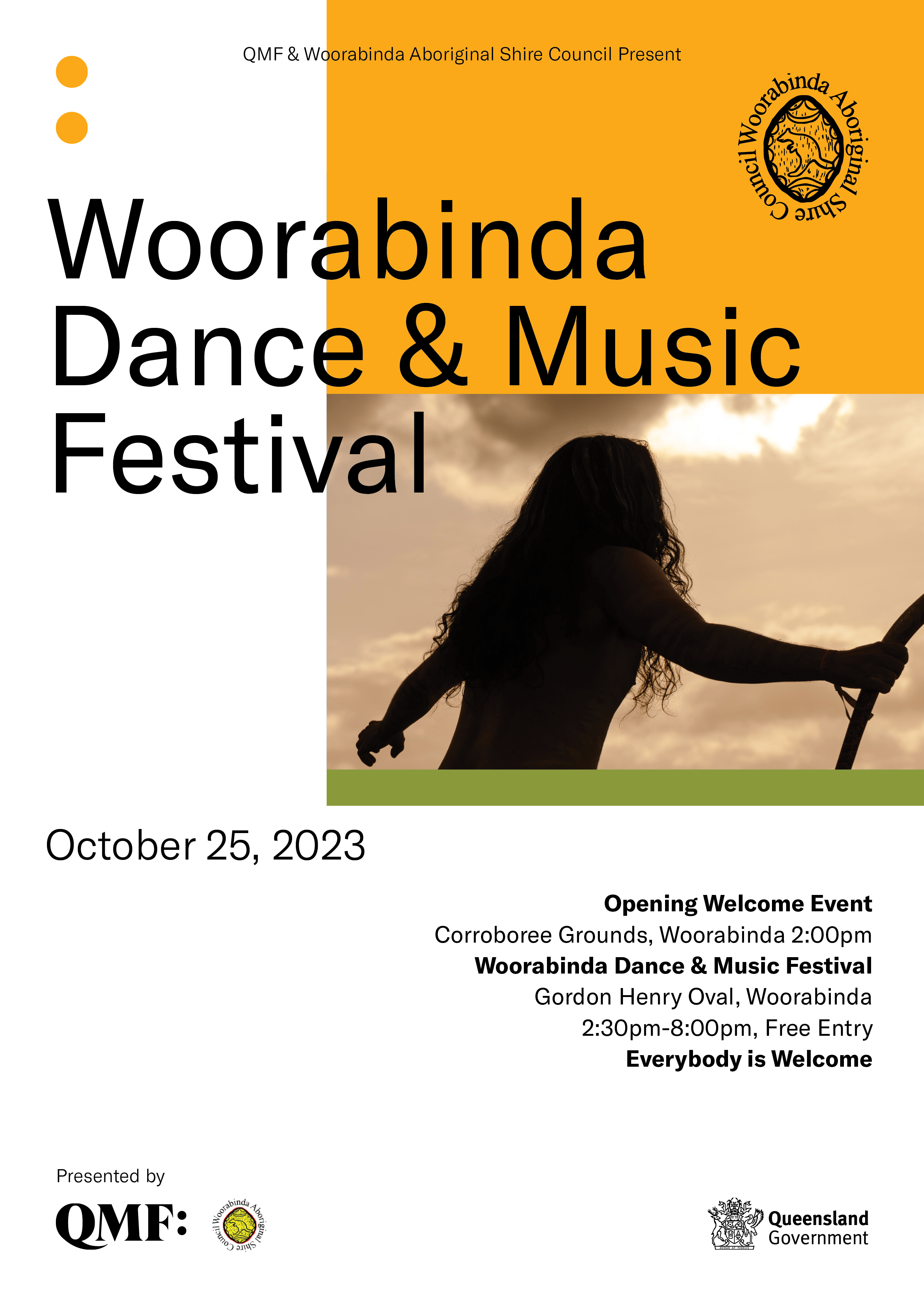
Festival Designs
Welcome to my creative realm! Delve into my portfolio and witness the captivating stories behind each project. Every design is a unique narrative, waiting to unfold. Let's collaborate to craft your festival's unforgettable chapter together.
2024
Explore the full portfolio by clicking on any of the designs below.
2023
Explore the full portfolio by clicking on any of the designs below
2022
Anywhere
Anywhere is a tiny house accommodation company that offers unique and eco-friendly accommodation options for travellers. They provide a range of tiny houses located in different parts of the country that are designed to be both comfortable and sustainable. Anywhere aims to provide their guests with a one-of-a-kind experience that is different from traditional accommodation options.
Project
Branding + Website
Satisfaction
100%
Client
Anywhere
Year
2023
Body. Soft.
Body Soft is a beauty and wellness brand that prides itself on creating organic products that are gentle on the skin.
The was wanting to hard launch into the Australian market and needed packaging designs that will captivate the eyes of its target audience and standout amongst competitors.
Project
Branding + Packaging
Satisfaction
100%
Client
Body. Soft.
Year
2023
Hiccup Society Co.
Hiccup Society Co, brand concept is centred around the idea that fun drinks can be good for you too.
In the packaging we designed, a look that is both unique and eye-catching. We used a can to make this drink versatile. The logo is designed with a simple wave effect and a Serif font. The label design features fun beach illustrations including sand castles, sharks, surfboards, and waves. The label also includes information about the flavour, ingredients, and health benefits of each variety of kombucha.
Project
Branding + packaging + 3D ad design
Satisfaction
100%
Client
Hiccup Society Co.
Year
2022
Harrison Craig
Harrison Craig was the Season Two Winner of The Voice Australia. Since then he has released three albums titled 'More than a Dream', 'L.O.V.E' and 'King of Vegas'. His music creates an aspirational experience by immersing his audience in his music and creating a level of intimacy.
The colour palette consisted of gold, bliss blue, taupe, French café blue, navy, and black. The colour combination ensured that the brand could resonate with Harrisons' younger and older audience.
The branding reflects that Harrison Craig is more than Jazz but the heart and soul of his music is embedded in Jazz. The social media assets, patterns, and logo variations supported the branding to create a new visual experience. The brand is not only fun but also classy and sensual.
The overall look of the brand is elegant, eloquent, classy, timeless, and original. We vectorised his handwritten signature into the logomarks to create an original and personal look.
Project
Branding + Editorial design + Social Media
Satisfaction
100%
Client
Harrison Craig
Year
2022
Nucleus Digital
Nucleus Digital is a digital marketing Agency with a strong track record of high-performance campaign development. They help grow online businesses and transform website traffic into leads and sales.
ND has helped small to medium-sized businesses overcome their marketing challenges. They have several years of experience working in digital marketing agencies both in Australia and Internationally. He leads digital marketing strategies through data-driven results.
ND wanted its brand to show the truth in marketing, to be inviting, friendly, and fun. We achieved this with a beautiful colour palette that makes every element pop. From the turquoise to the terracotta, all of the colours were chosen with love.
The honeycomb technique has made the branding elements shine! The purpose of the honeycomb was to show in a visual way how ND can connect your digital marketing needs with transparency and truth.
Client
Nucleus Digital
Year
2022
Project
Branding + website + Social Assets
Satisfaction
100%
The Mental Switch
The purpose of The Mental Switch is to educate individuals to Stop Breathe Think, Act, and Speak in that order to allow for time to speak with thought. To show people what to do. Not just tell them or teach them.
Their brand values are caring communication, inspiration, understanding, fairness, and honesty.
The branding for The Mental Switch is crafted in a way to appeal to both parents and children. We wanted to brand to be inviting, approachable, and give the feeling of safety and security.
Bright colours and sans serif typography were chosen for this branding to make The Mental Switch stand out in its niche.
Project
Branding + Editorial design + Merch + Social media
Satisfaction
100%
Client
The Mental Switch
Year
2022
2021
Fibs Linen
Fibs Linen is a homewear company that specializes in organic cotton and linen bedding. Their personality is fun, bright, and cheerful and we wanted to portray this in the branding.
The purpose of Fibs Linen is to help individuals have a better nights sleep. Their brand values are caring communication, connection, and kindness.
The branding for Fibs Linen is crafted in a way to appeal to a variety of individuals. We wanted to brand to be inviting, approachable, and give the feeling of lucury yet affordable bedding.
Bright colours and Serif fonts accomoied by sans serif typography were chosen for this branding to really make Fibs Linen stand out in their niche.
Client
Fibs Linen
Year
2022
Project
Branding + website + Social Assets
Satisfaction
100%
Toastie
Toastie is a childrenswear brand that specialises in clothing, toys and accessories.
Their products are made with the environment and your little ones in mind.
For the branding, we wanted to incorporate a fun and mischievous identity. We did this by creating a toast mascot called Butter! Toast really bought the brand to life!
We used a soothing colour palette that would allow for Toasties products to shine on their website and social media.
Project
Branding + Editorial design + Social media
Satisfaction
100%
Client
Toastie
Year
2022


